

Mom & Me Mini Sessions – Styling Advice

I’m SO excited for my studio mini sessions that are coming up this March and April (if you are reading this and you are interested in grabbing a spot, here’s the link for what is available!)
As a mom of 4 who has done the work to coordinate outfits for my own family, I know there is a TON to think about in regard to what to wear! I have different recommendations for different seasons and settings (for example, if you’re outside in greenery, don’t wear green!) and so here are my best tips for styling a studio session!
I rent a studio space at Studio North Milwaukee, a beautiful all-white studio! The floors and walls are white, meaning the background is completely neutral with the exception of any furniture we use. I chose this location because I love the way that a neutral space really brings attention to the PEOPLE in the space. With no other distractions, the emphasis is on the use of lighting and the emotions/expressions/love in the image.
In order to keep the emotions the center of the image, I highly recommend sticking to muted earthy tones/ neutrals! Don’t worry though, neutrals doesn’t just mean white! Below you’ll find a few tips as well as some ways that you might consider using neutral tones.
Start with Mom
My first piece of advice is to start with mom’s outfit first! Lets face it, we are probably the hardest on ourselves about what we wear. So, choose what you feel comfortable in and something that you love! Then, coordinate the kids around it by pulling tones from your outfit (if you choose a tan sweater dress, stick with warm tones for the kids!)
Formal or informal?
I have people ask me this all the time! Should we wear dresses? Or, should we go casual? This is totally up to personal preference. To be honest, both options are great. You should choose which one feels the most true to you, and run with it! If you do choose do to jeans, I’d recommend a light wash as it edits more true to my style. If you choose a dress, I’d recommend making sure that it isn’t too short so that you can easily play with your children in it. My posing style is definitely playful!
Thinking through Patterns
Patterns and textures are great to include! If you have 3 or more people in your photo, I’d recommend that at least one is in a pattern or a texture that stands out. Opt for small, dainty patterns rather than large and contrasty ones. My rule of thumb is that if you squint at the pattern, it should look almost like a solid color! Avoid super bold stripes or florals.
Color Considerations
This is the hardest part, in my opinion! I love a good monochromatic color scheme in the studio (for example, everyone in different shades/tones of the same color), but pulling colors together also works! Again, to keep the emphasis mostly on the emotions, I would recommend more muted tones. Below, I put together a few *sample* color palettes with some family photos I’ve taken. While they may not be in the studio, I think these color palettes would work so great in the studio or elsewhere! This is by no means an exclusive list, but I hope it’s helpful!
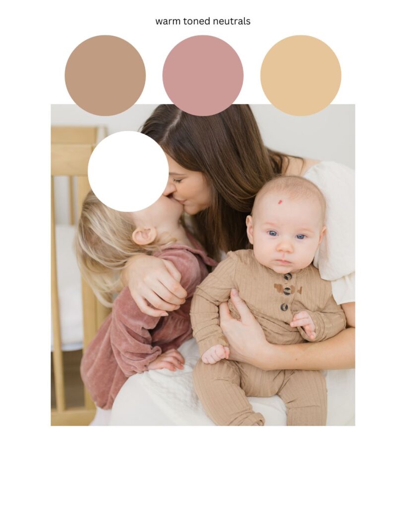
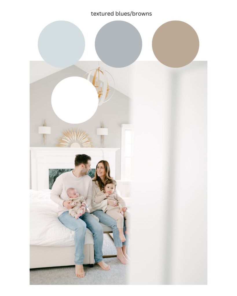
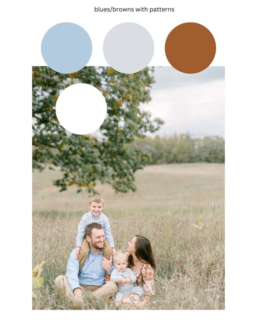
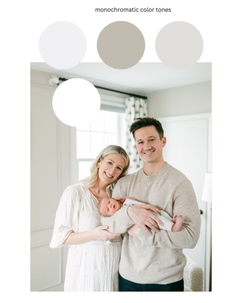
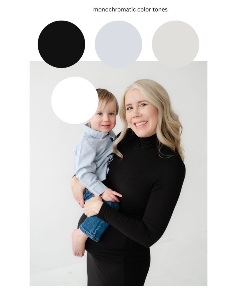
In case you’re wondering…yes!! Black is a neutral! As is brown!
If you need any help, I love to help clients with this, and I’m just an email away!!


